2. Boosted decision trees with xgboost#
Authors: Raghav Kansal
Run this cell to download the data if you did not already download it in from Tutorial #1:
!mkdir -p data
!wget -O data/ntuple_4mu_bkg.root "https://zenodo.org/record/3901869/files/ntuple_4mu_bkg.root?download=1"
!wget -O data/ntuple_4mu_VV.root "https://zenodo.org/record/3901869/files/ntuple_4mu_VV.root?download=1"
Show code cell output
--2024-01-09 17:58:50--  https://zenodo.org/record/3901869/files/ntuple_4mu_bkg.root?download=1
Resolving zenodo.org (zenodo.org)... 188.184.98.238, 188.184.103.159, 188.185.79.172, ...
Connecting to zenodo.org (zenodo.org)|188.184.98.238|:443... connected.
HTTP request sent, awaiting response... 301 MOVED PERMANENTLY
Location: /records/3901869/files/ntuple_4mu_bkg.root [following]
--2024-01-09 17:58:51--  https://zenodo.org/records/3901869/files/ntuple_4mu_bkg.root
Reusing existing connection to zenodo.org:443.
HTTP request sent, awaiting response... 200 OK
Length: 8867265 (8.5M) [application/octet-stream]
Saving to: ‘data/ntuple_4mu_bkg.root’

100%[======================================>] 8,867,265   5.55MB/s   in 1.5s

2024-01-09 17:58:53 (5.55 MB/s) - ‘data/ntuple_4mu_bkg.root’ saved [8867265/8867265]

--2024-01-09 17:58:53--  https://zenodo.org/record/3901869/files/ntuple_4mu_VV.root?download=1
Resolving zenodo.org (zenodo.org)... 188.184.98.238, 188.184.103.159, 188.185.79.172, ...
Connecting to zenodo.org (zenodo.org)|188.184.98.238|:443... connected.
HTTP request sent, awaiting response... 301 MOVED PERMANENTLY
Location: /records/3901869/files/ntuple_4mu_VV.root [following]
--2024-01-09 17:58:54--  https://zenodo.org/records/3901869/files/ntuple_4mu_VV.root
Reusing existing connection to zenodo.org:443.
HTTP request sent, awaiting response... 200 OK
Length: 4505518 (4.3M) [application/octet-stream]
Saving to: ‘data/ntuple_4mu_VV.root’

100%[======================================>] 4,505,518   4.11MB/s   in 1.0s

2024-01-09 17:58:55 (4.11 MB/s) - ‘data/ntuple_4mu_VV.root’ saved [4505518/4505518]
2.1. Loading pandas DataFrames#
Now we load two different NumPy arrays. One corresponding to the VV signal and one corresponding to the background.
import uproot
import numpy as np
import pandas as pd
import h5py

# fix random seed for reproducibility
seed = 7
np.random.seed(seed)

treename = "HZZ4LeptonsAnalysisReduced"
filename = {}
upfile = {}
df = {}

filename["VV"] = "data/ntuple_4mu_VV.root"
filename["bkg"] = "data/ntuple_4mu_bkg.root"

VARS = ["f_mass4l", "f_massjj"]  # choose which vars to use (2d)

upfile["VV"] = uproot.open(filename["VV"])
upfile["bkg"] = uproot.open(filename["bkg"])

df["bkg"] = upfile["bkg"][treename].arrays(VARS, library="pd")
df["VV"] = upfile["VV"][treename].arrays(VARS, library="pd")

# cut out undefined variables VARS[0] and VARS[1] > -999
df["VV"] = df["VV"][(df["VV"][VARS[0]] > -999) & (df["VV"][VARS[1]] > -999)]
df["bkg"] = df["bkg"][(df["bkg"][VARS[0]] > -999) & (df["bkg"][VARS[1]] > -999)]

# add isSignal variable
df["VV"]["isSignal"] = np.ones(len(df["VV"]))
df["bkg"]["isSignal"] = np.zeros(len(df["bkg"]))
2.2. Dividing the data into testing and training dataset#
We will split the data into two parts (one for training+validation and one for testing).
NDIM = len(VARS)

df_all = pd.concat([df["VV"], df["bkg"]])
dataset = df_all.values
X = dataset[:, 0:NDIM]
Y = dataset[:, NDIM]

from sklearn.model_selection import train_test_split

X_train_val, X_test, Y_train_val, Y_test = train_test_split(X, Y, test_size=0.2, random_state=7)
2.3. Define the model#
We are using a simple boosted decision tree model from the xgboost library.
import xgboost as xgb

# see https://xgboost.readthedocs.io/en/stable/python/python_api.html#xgboost.XGBClassifier
# for detailed explanations of parameters
model = xgb.XGBClassifier(
    n_estimators=10,  # number of boosting rounds (i.e. number of decision trees)
    max_depth=1,  # max depth of each decision tree
    learning_rate=0.1,
    early_stopping_rounds=5,  # how many rounds to wait to see if the loss is going down
)
2.4. Run training#
Here, we run the training.
trained_model = model.fit(
    X_train_val,
    Y_train_val,
    # xgboost uses the last set for early stopping
    # https://xgboost.readthedocs.io/en/stable/python/python_intro.html#early-stopping
    eval_set=[(X_train_val, Y_train_val), (X_test, Y_test)],  # sets for which to save the loss
    verbose=True,
)
[0]	validation_0-logloss:0.48588	validation_1-logloss:0.49037
[1]	validation_0-logloss:0.43483	validation_1-logloss:0.43617
[2]	validation_0-logloss:0.39488	validation_1-logloss:0.39379
[3]	validation_0-logloss:0.36247	validation_1-logloss:0.35934
[4]	validation_0-logloss:0.33569	validation_1-logloss:0.33082
[5]	validation_0-logloss:0.31318	validation_1-logloss:0.30684
[6]	validation_0-logloss:0.29404	validation_1-logloss:0.28647
[7]	validation_0-logloss:0.27773	validation_1-logloss:0.26900
[8]	validation_0-logloss:0.26370	validation_1-logloss:0.25397
[9]	validation_0-logloss:0.24876	validation_1-logloss:0.24161
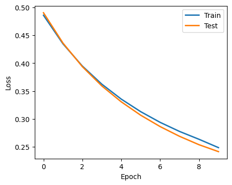
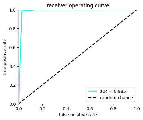
2.5. Plot performance#
Here, we plot the history of the training and the performance in a ROC curve
import matplotlib.pyplot as plt

evals_result = trained_model.evals_result()

fig = plt.figure(figsize=(5, 4))
for i, label in enumerate(["Train", "Test"]):
    plt.plot(evals_result[f"validation_{i}"]["logloss"], label=label, linewidth=2)

plt.xlabel("Epoch")
plt.ylabel("Loss")
plt.legend()
plt.show()


# Plot ROC
Y_predict = model.predict_proba(X_test)
from sklearn.metrics import roc_curve, auc

fpr, tpr, thresholds = roc_curve(Y_test, Y_predict[:, 1])
roc_auc = auc(fpr, tpr)


fig, ax = plt.subplots(1, 1, figsize=(5, 4))
ax.plot(fpr, tpr, lw=2, color="cyan", label="auc = %.3f" % (roc_auc))
ax.plot([0, 1], [0, 1], linestyle="--", lw=2, color="k", label="random chance")
ax.set_xlim([0, 1.0])
ax.set_ylim([0, 1.0])
ax.set_xlabel("false positive rate")
ax.set_ylabel("true positive rate")
ax.set_title("receiver operating curve")
ax.legend(loc="lower right")
plt.show()
df_all["bdt"] = model.predict(X)  # add prediction to array
print(df_all.iloc[:5])
     f_mass4l     f_massjj  isSignal  bdt
0  125.077103  1300.426880       1.0    1
1  124.238113   437.221863       1.0    1
3  124.480667  1021.744080       1.0    1
4  124.919464  1101.381958       1.0    1
7  125.049065   498.717194       1.0    1
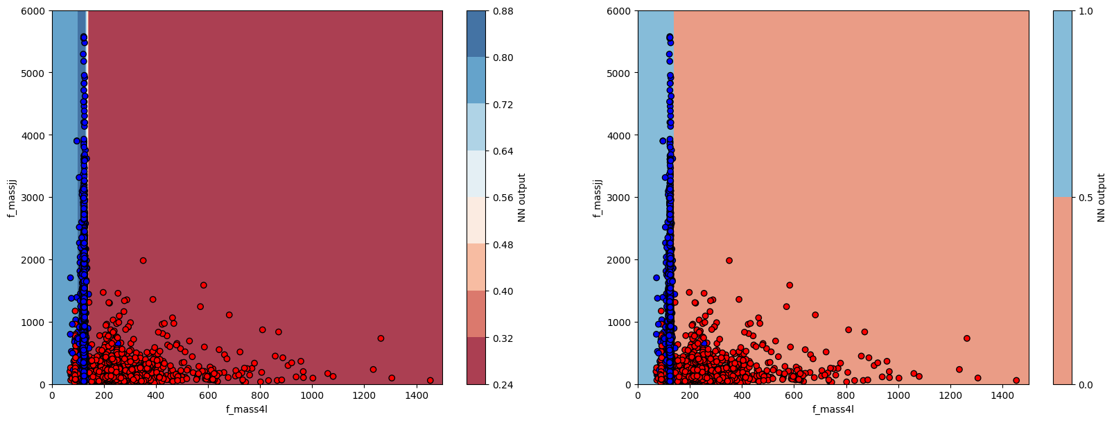
2.6. Plot BDT output vs input variables#
Here, we will plot the BDT output and devision boundary as a function of the input variables.
# make a regular 2D grid for the inputs
myXI, myYI = np.meshgrid(np.linspace(0, 1500, 200), np.linspace(0, 6000, 200))
# print shape
print(myXI.shape)

# run prediction at each point
myZI = model.predict_proba(np.c_[myXI.ravel(), myYI.ravel()])[:, 1]
myZI = myZI.reshape(myXI.shape)
(200, 200)
The code below shoes how to plot the BDT output and decision boundary. Does it look optimal?
from matplotlib.colors import ListedColormap

plt.figure(figsize=(20, 7))

# plot contour map of BDT output
# overlaid with test data points
ax = plt.subplot(1, 2, 1)
cm = plt.cm.RdBu
cm_bright = ListedColormap(["#FF0000", "#0000FF"])
cont_plot = ax.contourf(myXI, myYI, myZI, cmap=cm, alpha=0.8)
ax.scatter(X_test[:, 0], X_test[:, 1], c=Y_test, cmap=cm_bright, edgecolors="k")
ax.set_xlabel(VARS[0])
ax.set_ylabel(VARS[1])
plt.colorbar(cont_plot, ax=ax, boundaries=[0, 1], label="NN output")

# plot decision boundary
# overlaid with test data points
ax = plt.subplot(1, 2, 2)
cm = plt.cm.RdBu
cm_bright = ListedColormap(["#FF0000", "#0000FF"])
cont_plot = ax.contourf(myXI, myYI, myZI > 0.5, cmap=cm, alpha=0.8)
ax.scatter(X_test[:, 0], X_test[:, 1], c=Y_test, cmap=cm_bright, edgecolors="k")
ax.set_xlabel(VARS[0])
ax.set_ylabel(VARS[1])
plt.colorbar(cont_plot, ax=ax, boundaries=[0, 1], label="NN output")
plt.show()
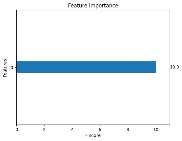
2.7. Feature Importances#
A nice feature of xgboost is that you can plot the relative importance of each feature to the BDT decision. Does this plot make sense?
xgb.plot_importance(trained_model, grid=False)
plt.show()
Question 1: Can you explain the loss curve?
Question 2: Can you explain the decision boundary?
Question 3: How can you improve the BDT preformance?
Question 4: What happens if you add/remove early stopping?